Ever planned a picnic and watched the sky turn into a rain curtain? That usually happens when you skim the forecast instead of reading it.
A weather forecast is basically a prediction written in symbols, numbers, and map patterns. When you learn how to read it the right way, you can plan outdoor time, pick safer routes, and dress without guessing. Even if you use an app, the basics work the same.
In March 2026, spring is starting to flex, and the swing can be big. Some regions see early warm spells, while others deal with late cold shots and stormy bursts. So the better you read the forecast, the more you can trust your plans.
The good news? You don’t need to be a meteorologist. You just need a simple order of operations: spot the layout and icons first, understand the core numbers, read the map changes, and avoid the most common mistakes.
Spot the Everyday Layout and Icons First
Most forecasts follow a familiar structure. First, you see your location and the time period. Next, you get a quick summary using icons and short text. Finally, you often see extra detail like hourly updates, wind info, and sometimes a map.
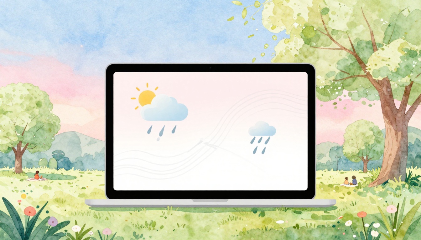
Icons are meant to give you fast answers. When you scan them first, you get the overall story before you get lost in the numbers. In most apps, the same symbols show up again and again:
- Sun for clear skies
- Cloud for overcast or mostly cloudy conditions
- Raindrops for showers
- Snowflakes for flurries or snow
- Thunderstorm for storms (often with higher risk)
- Wind lines or a wind icon for breezy conditions
On maps, you might also see dots or shading where rain is expected. Sometimes you’ll see special markings for snow or storm areas too.
Here’s the key point: the forecast layout helps you read in layers. If the icon shows partly cloudy, you expect a mix of sun and clouds. If the icon shows rain, you focus next on how likely it is and when it hits. That keeps you from overreacting to one detail.
If you ever wonder what specific symbols mean, compare against a trusted reference like the WMO weather icons guide. It helps when different apps use slightly different styles.
Quick Guide to Highs, Lows, and Timing Clues
Temperatures are the easiest thing to notice, so they’re also the easiest thing to misunderstand. A high usually means the warmest point you can expect in the day. A low means the coolest point.
Then comes timing. Many forecasts show something like a morning low and an afternoon high. If they show hourly temps, you can match your plans to the warmest or coolest hours.
Also watch for “feels like” numbers. That one matters when humidity or wind changes how your skin reads the temperature. On a damp day, “feels like” can run warmer than the air temp. In wind, it often drops.
Finally, don’t ignore the range. If the forecast says something like a 70°F high and a 50°F low, that’s a 20-degree swing. For planning, that’s your signal to layer up. One jacket might be enough for midday, but not for night.
A simple way to use this: match your activity to the temperature peak. If you’re doing a long walk, aim for the hours near the higher temps. If you’re driving late, prepare for the low to arrive faster than you expect.
Master the Core Numbers: Temps, Rain Chances, Wind, and Pressure
Once you’ve got the layout and icons, it’s time for the core numbers. Think of these as the “ingredients” of the forecast. You want all the ingredients, not just one.
Most forecasts give you:
- Temps (air temperature, sometimes plus “feels like”)
- Precipitation chance (often listed as PoP)
- Wind (speed and direction)
- Pressure (sometimes on advanced views, maps, or model pages)
Let’s start with precipitation chance, because it’s the most misunderstood number.
Crack Precipitation Odds and What They Don’t Mean
In many U.S. forecasts, PoP means probability of precipitation. For example, 60% PoP does not mean it will rain everywhere. It also does not tell you how heavy the rain will be.
Instead, it means that for your specific area and the forecast time window, precipitation is considered likely enough to hit. The forecast also treats precipitation as an event threshold, not a guarantee of every street getting soaked.
If you want an official breakdown, check the National Weather Service PoP FAQ. It explains how that percentage should be interpreted.
Here’s a common real-life scenario. You see 70% PoP for “this afternoon.” Then you get a quick shower for 10 minutes. Or you get a few light drops, but not a downpour. Either way, you still got precipitation in the forecast period.
Also look for timing. If the forecast breaks out hourly PoP, you can spot when rain is most likely. If it’s only daily PoP, plan with more caution.
One more detail: if the forecast shows expected rain amounts or duration, that’s extra signal. Use it. If it doesn’t, treat the PoP as a chance, not a certainty.
Wind Speed, Direction, and Pressure Made Simple
Wind can change comfort fast. It also changes safety, especially for driving in gusty weather or being outside during storms.
When you see wind like “10 mph NW,” that usually means the wind is coming from the northwest at about 10 miles per hour. The direction tells where the wind starts. It helps to imagine the arrow pointing away from the origin.
Pressure helps explain the “why” behind wind and storm patterns. In simple terms:
- Higher pressure often links to more stable conditions
- Lower pressure often links to stormy or unsettled weather
On some maps, you’ll see pressure centers with lines called isobars. When isobars are close together, it often signals stronger winds. When they spread out, winds often relax.
So when wind and rain are both showing up, read them as a pair. Wind-driven rain can feel colder, and it can reduce visibility. That matters if you’re commuting during a front.
Decode Weather Maps for Big-Picture Changes
Icons and numbers help with planning. Maps help with forecasting what changes are coming next.
On many weather pages, you’ll see a surface map with systems across a large region. The map might show current conditions, or it might show what’s expected over the next several hours.
Here are the big map features to learn:
- Fronts, which show boundaries between air masses
- Highs and lows, which show pressure centers
- Isobars, which show wind tendencies
- Symbols for rain or snow, depending on the map layer
If you want a friendly guide, NOAA explains how to read these types of surface maps in how to read surface weather maps. It’s a solid reference when you’re learning.
When you can interpret fronts, you stop treating storms as random surprises. Instead, you start seeing them as a moving storyline.
Fronts and What Weather They Deliver
Fronts are like moving borders. When one front reaches you, the weather often changes.
- Warm fronts often bring more gradual cloud cover and steady rain. Temps may rise as the front approaches.
- Cold fronts often bring quicker shifts, with sharper bursts of storms or heavier showers. Temps may drop after the front passes.
- Stationary or weakening fronts can bring on-and-off weather for longer periods, because the boundary slows down.
A practical tip: if your forecast says rain is possible, check the map for where the next front is. If a front is headed your way soon, don’t plan as if the sky will stay calm.
Also keep expectations realistic in March. Spring transitions can turn a “small chance of showers” into short, intense bursts.
Pressure Patterns and Isobars for Wind Forecasts
Look for the pressure centers first. A low usually means rising air and a higher chance of clouds and storms. A high often means sinking air and more stable weather.
Then watch the isobars. Close isobars often mean the pressure changes quickly over distance. That can increase wind speed because air tries to move from higher to lower pressure.
For travel, this matters. If the map shows strong pressure gradients near your route, expect gustier conditions even if rain looks light.
And for outdoor plans, it helps too. Wind can dry the ground fast after a shower, or it can keep damp air feeling cold all day.
Dodge These Common Reading Mistakes
If weather forecasts feel “wrong,” it’s often because the reader used them wrong.
Start with the big mistakes that cause most surprises. Then fix each one with a simple habit.
- Skipping the full layout: You read only one line, like “chance of rain.”
- Treating PoP like coverage: PoP is about your spot and time window, not “will every mile get rain.”
- Misreading wind direction: You think the wind blows toward the label instead of from it.
- Ignoring the map: You miss a front arriving earlier than the icon suggests.
- Forgetting context: Humidity, cloud cover, and visibility can change what you experience.
A quick example: if you see high pressure and sunny skies today, you might assume clear weather all day. But if a warm front is nearing, clouds can build faster than your morning expectations. Then the “sunny” part feels misleading.
Also remember that forecasts are probabilistic. Weather apps work best for everyday decisions, but local timing can still shift. NOAA also notes that weather forecasting has real limits, because the atmosphere can change quickly. You can read about those challenges in weather forecasting.
Why Wind Direction Trips Up Most People
Wind direction gets people because it’s written from the source.
If you read “north wind,” it means wind moves from the north toward the south (in most standard map conventions). So if you want to know how it will hit you, imagine the air coming toward your location from that labeled direction.
On maps, you can also spot wind barbs or arrows. Use the tail of the barb as the wind origin. Once you get that, wind forecasts become much easier to trust.
Pro Tips to Make Forecasts Work for You
Now that you know what the forecast is saying, make it useful. The goal isn’t perfect prediction. The goal is better decisions.
These habits help you read weather like a pro, even if you’re just checking before work.
1) Check a short range first.
If you’re planning today or tomorrow, focus on the near-term forecast. Long range predictions get less certain fast.
2) Read time windows, not just a daily summary.
Hourly breakdowns can show rain moving in and out. That’s where umbrellas often save you.
3) Use “feels like” and wind together.
On windy days, temperature comfort drops quickly. Dress for the combined effect, not just the air temp.
4) Add one extra layer of context.
If your app shows humidity-related clues, cloud cover, or visibility, use them. Dense humidity can make heat feel sticky. Low visibility makes driving slower for longer.
5) Plan around the risk, not the vibe.
If PoP says 80% but it’s only during a 30-minute window, you can shift the event. If it says 40% with storms nearby, you might bring a cover and keep an eye on updates.
In March 2026, this matters even more because swings can be uneven by region. Warmer spells can tempt you outside early, but a colder push can still bring rain bursts or a drop in temps. If you live in the areas that are trending warmer, you might also see stronger storm chances during transitions. If you’re in the colder end, frost and wintry flurries can still show up between warm days.
So treat the forecast like a moving schedule. Update your plans when the forecast updates, especially if you’ll be out during the likely change hours.
Make the forecast work for you starting today
If you take one thing from this, take the order: layout and icons first, then key numbers, then maps for changes. When you read that way, the forecast stops feeling like a mystery.
Tomorrow morning, try a quick routine. Open the forecast, look at the icon trend, check PoP timing, then scan the map for the next front. You’ll notice more patterns, and fewer “surprises.”
What’s the one number you usually trust most, and what’s the one thing that has fooled you before? Share it, then use the next forecast to test your new reading habit.